Home Design Illustration Craft About Image Map
Showing posts with label Typography. Show all posts

Tuesday, 22 October 2013

Looe, Cornwall


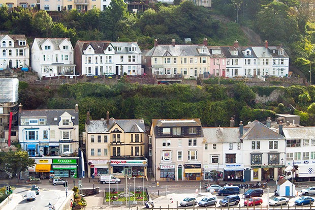
A while ago I visited the little Cornish town of Looe. It was delightful, everything you want in a break away from the city. The views alone were spectacular. I didn't get a go in a boat (unless you count a ferry across the harbour!) but there's always next time... As you might guess I took quite a few photo's whilst there.


There were a lot of house names dotted around Looe, many of them hand painted so I of course took lots of photos of those!


I also had a bit of a play with a telescope...with mixed results.


Lastly, a beautiful sunset that lit up the town.

Friday, 26 April 2013

Twisted Type

In progress: mapping letters to map projections, showing off the distortion. Time consuming but fun! 


Wednesday, 27 March 2013

Toads & Letters

Yesterday I sketched a toad in a rather sharp Alexander McQueen suit.


I also did a few quick lettering sketches. I'm not sure if these are actually going to be useful, but I did enjoy doing them.


Thursday, 28 February 2013

Wind in the Water


I really enjoyed dabbling with the watercolours the other day, so I decided to paint the other two characters from Wind in the Willows: Ratty and Mr. Badger. I'm really pleased with these little sketches, I like how playful it is and I look forward to doing some more in depth paintings. I want to work on layering and including more detail, as these are pretty basic. I might however prefer them with less detail, it makes a change from my usual drawings! These are pretty quick to do, so I think it's definitely a good technique to get used to. 

I am using the Penguin brief as an excuse to do these, so I thought I should try going in the direction of actual ideas. Haven't got past the cliché's however...gotta get them out of my system first! Couldn't resist this, wind and watercolours. Thought the pink one was perhaps a bad move, looks more like the typography you'd find on a cheesy teen horror book. 


Saturday, 27 October 2012

ZERO PART TWO

This is an update on the Zero project from last year. I realised I hadn't put the final outcome up which is a shame as it's one of my favourite projects. The concept is basically the same, but it's consolidated into one book to make for easier reading!


Wednesday, 7 March 2012

TOWERS OF TYPE

Waiting for the workshops to open can be rather dull, so what do bored graphics students do? Build towers of type.


Thursday, 1 March 2012

ZERO

I'm quite fond of these little dictionary's for politicians I made, unfortunately it got rather complicated to explain so will need some reworking. The concept is based on semantic satiation, where the meaning of words are forgotten the more times they are repeated in sequence, and as we know politicians have their buzzwords they like to reuse, which often have no real meaning. There are five editions of the dictionary, in which the type for each definition is more spread out on the page each time, until it is unreadable. The last book is a thesaurus to provide new words in place of the ones that have lost meaning.

Make sense? Here's some pictures.


Tuesday, 3 January 2012

IN A WORLD OF 100 PEOPLE

We were given a type brief in which we had to represent a set of statistics typographically, not like the infographic pictures that we seem to be swamped with everywhere. I worked on this with Thom Farrall, and we found it quite a challenge to come up with a decent way of representing the stats. We are quite pleased with the result, though it is still not finished - the layout needs to be a bit more interesting!


Statistics